The one thing that has changed most significantly in OS X 10.10 is probably the design of the typical titlebar.
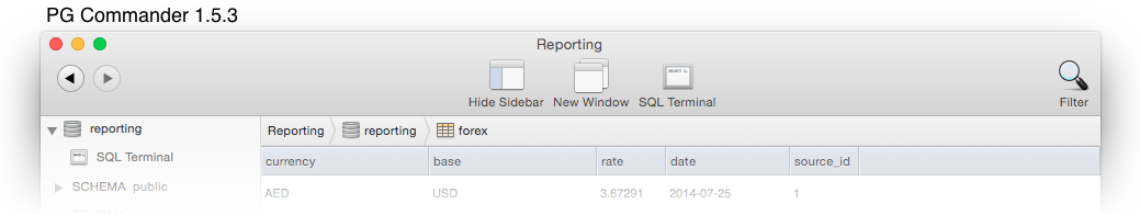
Over the last few years, titlebars of Mac apps have grown to a humongous size. As an example, take the titlebar of PG Commander 1.5.3: it sports the standard traffic light controls, a more or less useless window title, and a bunch of loosely spaced giant toolbar icons with labels.
This waste of screen estate is exacerbated by the fact that all Macs currently sold have widescreen displays. Vertical space is especially constrained on the smaller Macbooks.
Yosemite addresses this issue by promoting slimmer titlebars. Take a look at some of Apple's apps:
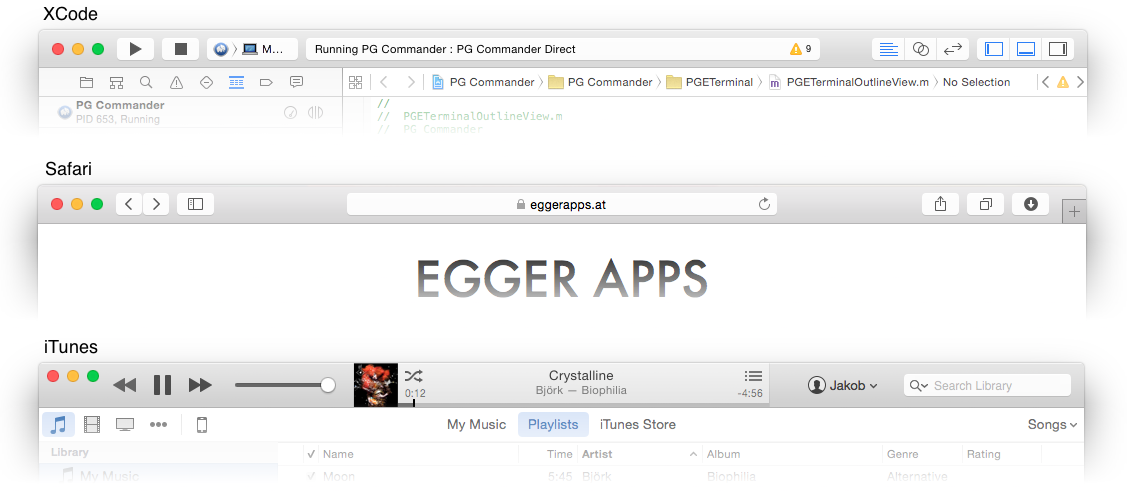
The new titlebars almost look cramped. Toolbar items sit flush against the top edge of the window, at the same level as the traffic lights. The window title is often replaced by a status display. Button labels are gone.
I've followed Apple's lead when redesigning PG Commander 2.0 for Yosemite. Here's my new titlebar:
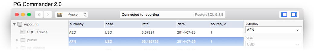
Everything is now in a single line. I replaced the title with a status display, and trimmed the buttons to the bare minimum. (Don't worry, the toolbar is customizable. If you think I removed too many buttons you can add them back.) Finally, to further save vertical real estate, I even replaced the path bar with a popup menu.
The new design offers 4 extra lines of content — that's a lot on an 11-inch Macbook Air! And even if you're not space constrained, I'm sure you'll at least find the new layout cleaner and more coherent.