The first thing you see when you open PG Commander is the favorites window. This window sets the tone when a potential customer first tries my app. I think it's extremely important to make a good first impression, so I put a lot of effort into the design of this window.
Here's what the current version looks like on Yosemite:
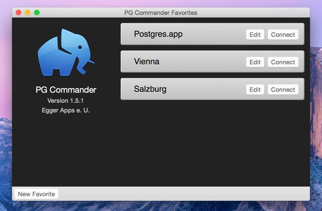
Some of the user interface elements automatically acquired the new Yosemite look. The title bar, the bottom bar, and the buttons are all standard, so they picked up the new design. The window doesn't look bad, but it next to Apple's sleek new apps it looks rather old fashioned.
The tagline on my website is “A modern PostgreSQL Client for your Mac”. PG Commander was modern when I released it on 10.8. On OS X 10.10, this style seems almost as antiquated as the old skeuomorphic iCal app.
Yosemite is bright, lightweight, and vibrant. Here's my prototype for the favorite window in version 2.0:
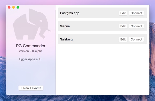
I threw out all the gloss, the faux-3D effects, and the black background. I threw out the title bar and the bottom bar. I went with a seamless design inspired by Apple's Messages app. The individual elements are flatter, but the translucent background adds a whole new sense of depth.
This is a design that I'm comfortable to display next to Apple's redesigned apps. It's not perfect yet. The text layout still needs some tweaking. Some of the text should probably be removed. It's not absolutely necessary to display app name, version number and the name of the registered user.
Furthermore, there is a nice side effect to the new design: it's much faster to draw flat shapes instead of shaded elements with 3D effects. As a result animations are much smoother in the new version!